That gorgeous serif your branding agency picked looks stunning on a billboard. It's also nearly illegible at 14px on a phone screen. Typography decisions made for print are actively harming digital products, and it's time for brand designers to start thinking screens first.
There's a particular kind of pain that every digital designer and developer has experienced at least once.
The client arrives with a brand new identity package, beautifully crafted by a branding agency, complete with a primary typeface that looks absolutely magnificent on letterhead, business cards, and large format signage. Then you try to set body copy with it on a mobile screen and everything falls apart.
Thin hairlines disappear at small sizes. Decorative ligatures create awkward spacing in UI labels. The character set doesn't include the specific weights you need for hierarchy on screen. The licensing doesn't cover web embedding. Or worst of all, the font simply wasn't designed for screen rendering and it looks like mud on anything below 24px. You're now stuck trying to build a world class digital product with a typographic foundation that was never designed to support one.
This isn't an edge case.
It's one of the most common friction points in digital product development, and it stems from a fundamental disconnect in how branding decisions are made. Most brand identity work is still led by designers whose primary expertise and reference points are in print and physical media. This is understandable. Branding has historically lived on paper, packaging, signage, and physical environments. But the reality in 2026 is that for most companies, the digital touchpoints outnumber the physical ones by orders of magnitude. Your website, your app, your email campaigns, your social content, and your digital advertising will collectively reach more people more often than your business cards and brochures ever will.
When a typeface is selected primarily for how it performs in print, the digital team inherits a constraint that can compromise the product in ways that are surprisingly difficult to work around.
Body copy legibility is the most obvious issue. Typefaces designed for large format or print applications often have fine details, thin strokes, and tight spacing that render poorly on screens, especially at the sizes required for mobile interfaces. What looks refined and elegant at 48pt on a printed page can look spindly and hard to read at 16px on a retina display.
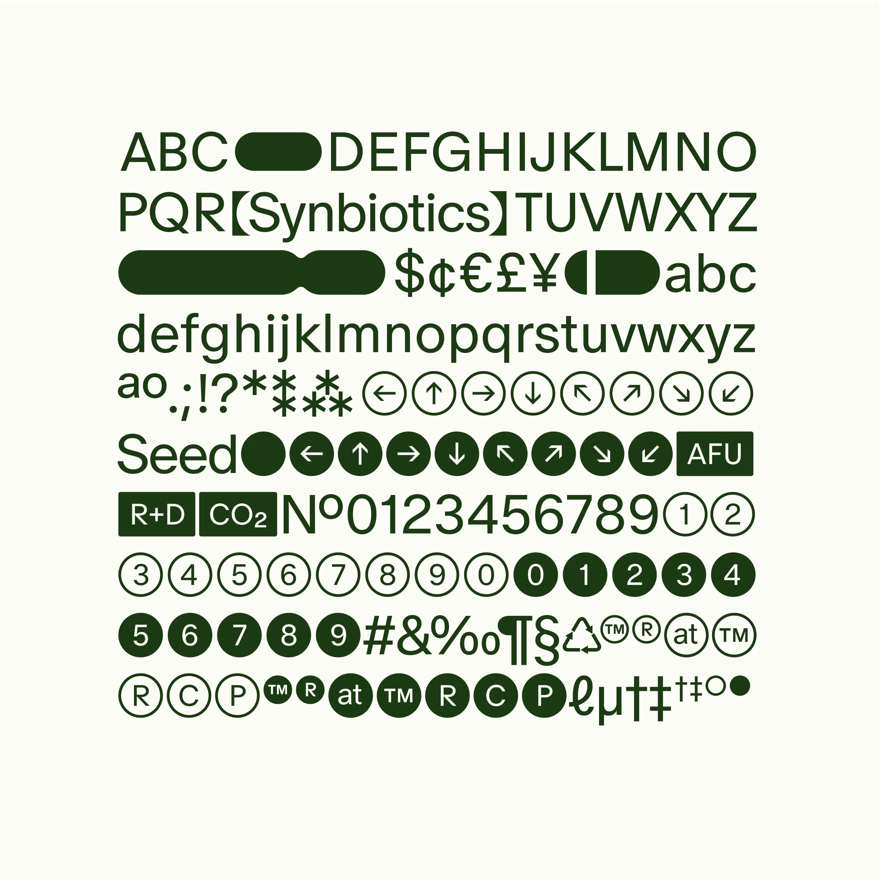
But legibility is only part of the problem. Digital interfaces have typographic requirements that simply don't exist in print. You need a typeface that performs well across a wide range of sizes, from 12px form labels to 64px hero headlines. You need multiple weights for establishing visual hierarchy in dense UI layouts. You need tabular figures for data displays. You need clear distinction between similar characters like uppercase I, lowercase l, and the number 1, because ambiguity in a UI label or a data table isn't charming, it's a usability failure. You need the font to load quickly over the network without blowing up your performance budget. And you need it to render consistently across operating systems, browsers, and screen densities, which is a challenge that print designers have never had to consider.
The solution isn't to throw out branding considerations entirely.
Brand expression in digital products matters. Typography is one of the most powerful tools for establishing tone, personality, and recognition. The solution is to change when and how typographic decisions are made in the branding process.
Brand designers need to be evaluating typefaces on screen from the beginning, not as an afterthought. This means testing at real sizes on real devices, not just zoomed in on a 27 inch display. It means considering variable fonts, which offer a single file with a continuous range of weights and widths, reducing load times while providing the flexibility digital interfaces demand. It means ensuring the chosen typeface has proper hinting for screen rendering, sufficient language support, and licensing that covers web and app embedding without per impression costs that scale unpredictably.
It also means accepting that sometimes the right answer is a dual type system: one typeface for brand expression in headlines, hero moments, and marketing materials where it can perform at the sizes it was designed for, and a highly legible workhorse typeface for body copy, UI elements, and data display where readability is non negotiable. This isn't a compromise. It's good typographic practice. The best digital products in the world use this approach because it works.
For development teams working in React or building with design systems, typography decisions ripple through everything.
Your font choice affects your component library, your spacing scale, your line height calculations, your responsive breakpoints, and your performance budget. A typeface that requires three separate font files for the weights you need adds hundreds of kilobytes to your initial load. A typeface that doesn't support proper OpenType features forces workarounds in your CSS. These are technical costs that compound across every page of your product, and they're almost always invisible to the branding team that made the original selection.
The next time a brand identity package lands on your desk, look at the type system first. Test it at 14px on a phone. Set a paragraph of body copy with it and read it on a real device. Check the character set, the available weights, the file sizes, and the licensing terms. If it doesn't hold up, that conversation needs to happen before a single component gets built. Retrofitting a type system into an existing product is exponentially more expensive than getting it right from the start.
Want to start getting it right? Here's some reading to get you started:
- Google Fonts: Variable Fonts - An excellent primer on variable fonts and why they're increasingly the right choice for digital products.
- Smashing Magazine: A Comprehensive Guide to Font Loading - Deep dive into font loading strategies that directly impact performance and user experience.
- Typewolf - Curated typography inspiration with a strong focus on how typefaces perform in real digital contexts.
- Web.dev: Best Practices for Fonts - Google's performance focused guide to font loading, rendering, and optimization for the web.
- iA: The Web Is All About Typography - iA's foundational essay on why typography is the single most important design decision on the web. Still essential reading.
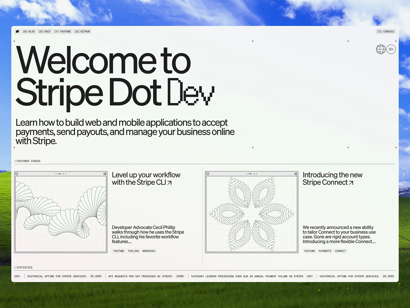
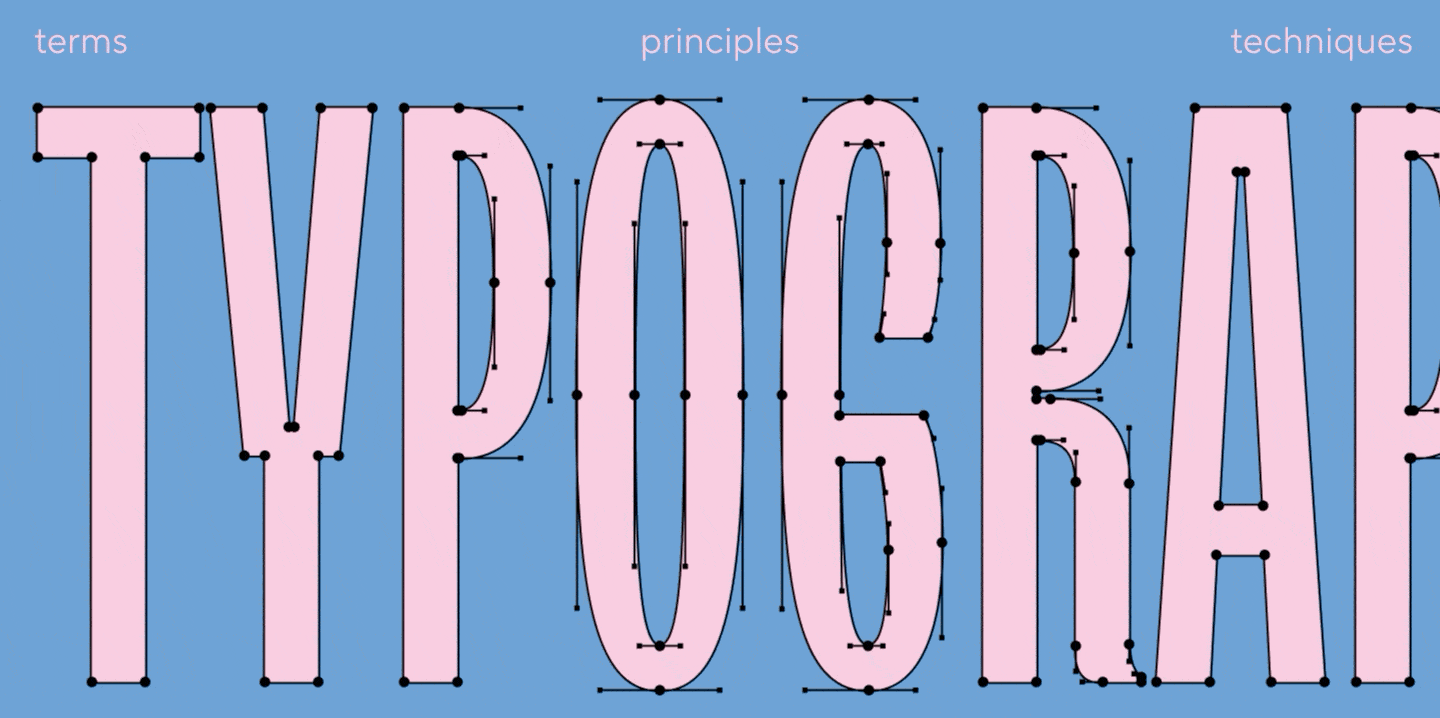
Below are some awesome examples of creative and typography heavy designs from awwwards.com