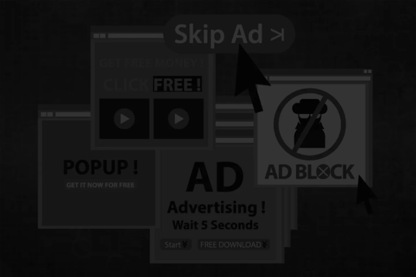
Cookie banners, newsletter modals, notification prompts, chat widgets, discount overlays, and age gates. Your users haven't even seen your content yet and they've already closed five things. The mobile web is drowning in interruptions and most of them are actively driving people away.
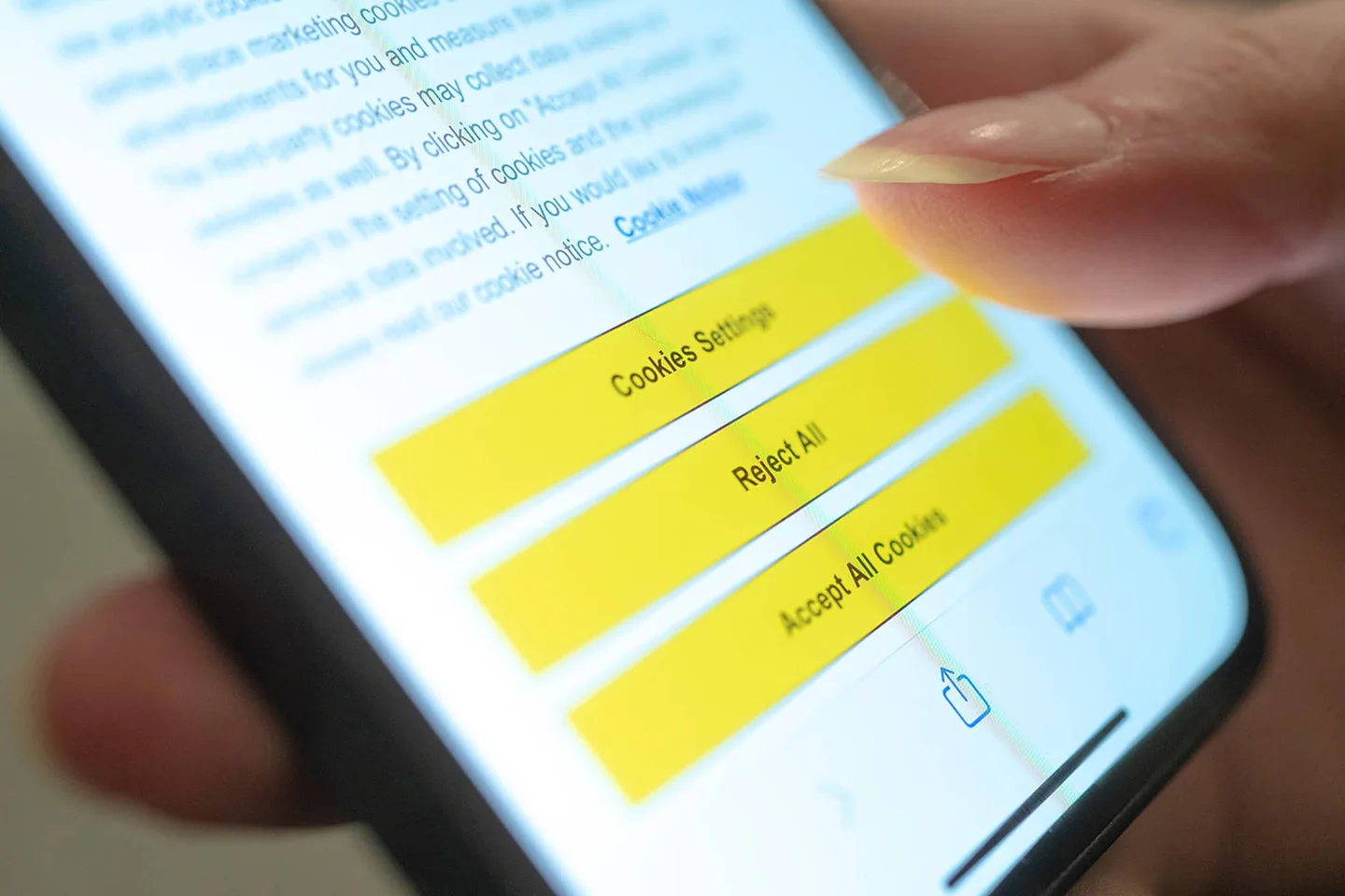
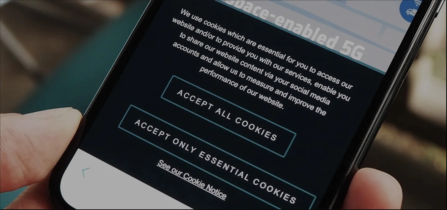
Try this experiment. Pick any major retail or media site, open it on your phone, and count how many things you have to dismiss before you can actually see the content you came for. Cookie consent banner. Newsletter signup modal. Push notification prompt. Chat widget in the bottom corner. App download banner. Discount code overlay. On a bad day you'll hit four or five of these in the first ten seconds, each one demanding attention, each one covering the content underneath, and each one requiring a tap on a tiny close button that was clearly designed by someone who has never used a phone with one hand.
This is the state of the mobile web in 2026, and it's absurd.
The irony is that every single one of these interruptions exists because someone, somewhere, had data showing it "works".
Newsletter modals convert at 3%. Push notification opt ins increase engagement by 20%. Chat widgets reduce support ticket volume. In isolation, each metric looks like a win. But nobody is measuring the cumulative cost of all of them firing at once. Nobody is quantifying the users who bounced before they ever engaged with the actual product because they were buried under a stack of overlays demanding their email, their cookie preferences, their permission to send notifications, and their attention for a limited time offer.
The problem isn't that any single one of these patterns is inherently bad.
Cookie consent is legally required in many jurisdictions. A well timed chat widget can genuinely help users who are stuck. Newsletter signups have legitimate value when the content is worth subscribing to. The problem is that teams are implementing all of them simultaneously with zero consideration for how they interact with each other or how they affect the overall experience, particularly on mobile where screen space is precious and every overlay covers 100% of the viewport.
On desktop, a small modal in the center of a large screen is a minor annoyance. On a 6.7 inch phone, that same modal is a wall. Add a cookie banner at the bottom and a notification prompt at the top and your user is staring at a screen where the actual content is completely invisible, sandwiched between three layers of interruption. They haven't scrolled yet. They haven't read a single word of what they came for. And you're asking them to make decisions about cookies, newsletters, and notifications before they've even decided whether your site is worth their time.
From a technical standpoint, this overlay avalanche also creates real problems.
Z index stacking conflicts between multiple overlays cause rendering issues. Focus trapping in modals breaks keyboard navigation when another modal tries to steal focus simultaneously. Screen readers encounter a nightmare of competing aria live regions and focus traps. Performance takes a hit from the additional JavaScript required to manage timing, animation, and dismissal logic for each overlay. And on older devices or slower connections, these scripts often load and fire after the main content has rendered, causing jarring layout shifts that further degrade the experience.
The solution starts with something radical: restraint. Before adding any interruption to your product, your team should be asking a simple question. Is this worth stopping the user for? Not "does this convert" in isolation, but "does this justify interrupting someone's experience right now, in this context, alongside everything else we're already showing them?" Most of the time, the honest answer is no.
For the interruptions that do earn their place, timing and sequencing matter enormously.
A newsletter prompt that appears after a user has read three articles and clearly finds your content valuable is a fundamentally different experience than one that fires on page load before they've read a single paragraph. A cookie banner that uses a slim, non blocking bar at the bottom of the screen is a fundamentally different experience than a full screen overlay that demands interaction before anything else can happen.
If you're building with React or Next.js, consider building an interruption manager, a single system that controls the sequencing, priority, and mutual exclusivity of all overlays across your application. No two modals should ever be visible simultaneously. Cookie consent should resolve before anything else fires. Low priority prompts should be deferred until the user has demonstrated engagement. This isn't complicated to build, but it requires the discipline to centralize what most teams implement as disconnected, independently triggered components scattered across the codebase.
Your users came to your site for a reason. Respect that reason. Let them see your content, experience your product, and engage on their own terms.
The most effective way to earn their email, their permission, and their trust is to deliver value first and ask later. Everything else is just noise.
Want to go a little deeper? Dive into these:
- Nielsen Norman Group: The Most Hated Online Advertising Techniques - Research backed evidence on which interruption patterns users find most hostile. Spoiler: modal overlays are near the top.
- Google: Intrusive Interstitials Penalty - Google actively penalizes sites that use intrusive interstitials on mobile. Your pop up strategy may be hurting your search rankings.
- Web.dev: Core Web Vitals - Layout shift caused by late loading overlays directly impacts your CLS score. Google is measuring this and it affects ranking.
- Baymard Institute: UX Research on E-Commerce - Extensive research on how checkout flows, overlays, and interruptions affect conversion in e-commerce contexts.
- GDPR Cookie Consent Best Practices - If you have to show a cookie banner, at least do it in a way that's compliant without being hostile.