Accessibility isn't a compliance checkbox and usability isn't a nice to have. They're the foundation that every great user experience is built on. If your product doesn't work for everyone, it doesn't work. Full stop.
There's a conversation that happens in almost every project kickoff meeting, and it goes something like this. Someone mentions accessibility. Someone else nods and says "absolutely, we'll make sure it's WCAG compliant." Then everyone moves on to talk about the hero animation and the custom scroll interactions and the elaborate page transitions, and accessibility quietly slides to the bottom of the backlog where it lives until two weeks before launch when someone remembers it exists.
This is a problem.
Not just ethically, although that should be reason enough, but practically. Accessibility and usability aren't separate concerns that get bolted onto a finished product. They're the structural foundation that determines whether your product actually works for the people who need to use it. And the number of people affected is far larger than most teams realize.
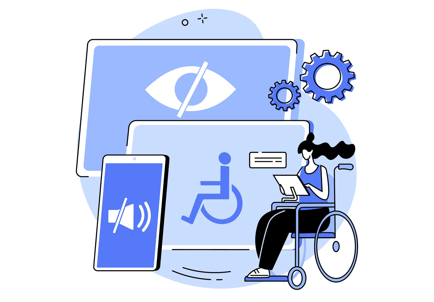
Roughly one in four adults lives with some form of disability.
That includes permanent conditions like blindness or motor impairments, but it also includes temporary and situational disabilities that affect virtually everyone at some point: a broken arm, a bright sunlit screen, a loud environment where audio is useless, or simply holding a baby in one arm while trying to navigate your app with the other. When you design for accessibility, you're not designing for a niche edge case. You're designing for the full spectrum of how humans actually interact with technology.
On the usability side, the bar has never been higher.
Users today have been trained by the best products in the world to expect interfaces that are fast, intuitive, and forgiving. If your navigation is confusing, they leave. If your forms are frustrating, they abandon. If your content is hard to read, they bounce. You don't get credit for having a beautiful interface if people can't figure out how to use it. Every design decision should pass a simple test: does this make the product easier to use, or did we add it because it looks cool in a portfolio?
The good news is that modern development tools have made building accessible, usable products significantly easier than it used to be. React's ecosystem includes robust libraries for focus management, screen reader announcements, and keyboard navigation. Component libraries like Radix UI and React Aria provide accessible primitives out of the box so you're not reinventing the wheel on every project. Next.js handles semantic HTML rendering on the server, which gives assistive technologies a properly structured document to work with from the first paint.
But tooling only gets you so far.
The real shift has to happen in how teams think about the design process. Accessibility can't be an audit you run at the end. It needs to be a constraint you design within from the start, the same way you design within the constraints of screen sizes or performance budgets. When a designer proposes a low contrast colour combination because it looks elegant, the conversation shouldn't be "we'll fix the contrast later." It should be "that contrast ratio doesn't meet AA standards, so let's find an elegant solution that does."
The same principle applies to usability. Information architecture, navigation patterns, form design, error handling, loading states, and empty states should all be designed and tested before you start polishing the visual layer. We've seen too many projects where enormous effort goes into microinteractions and motion design while the basic task flows are confusing, error messages are unhelpful, and the mobile experience feels like an afterthought.
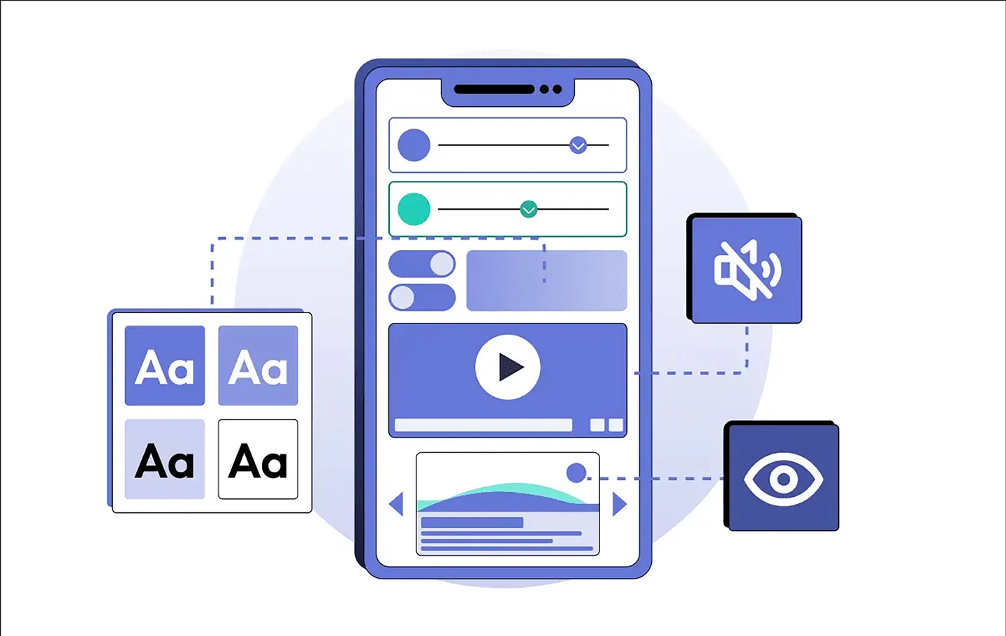
Here's what we've found works: treat accessibility and usability as design constraints, not as items on a QA checklist. Build with semantic HTML from day one. Use proper heading hierarchies. Ensure every interactive element is keyboard accessible. Test with screen readers regularly, not just before launch. Design touch targets that are large enough for real human fingers. Write error messages that tell people what went wrong and how to fix it. These aren't glamorous tasks, but they're the difference between a product that delights and one that frustrates.
And here's the thing that often surprises teams: optimizing for accessibility and usability almost always makes the product better for everyone.
Proper heading structure improves SEO. Keyboard navigation benefits power users. Clear error messages reduce support tickets. High contrast text is easier to read in direct sunlight. Generous touch targets prevent mis taps for every user, not just those with motor impairments. The accommodations you make for the people who need them most end up improving the experience for everyone else too.
Your product's visual design is important. Motion and delight and craft all matter. But none of it means anything if people can't use what you've built. Start with a foundation that works for everyone, and then make it beautiful. That order matters.
Have we made you care?
checkout these resources:
- Web Content Accessibility Guidelines (WCAG) 2.2 - The current standard. The quick reference guide is more practical than the full spec for day to day development.
- Radix UI Primitives - Unstyled, accessible React components that handle focus management, keyboard navigation, and screen reader support out of the box.
- React Aria by Adobe - Adobe's library of accessible React hooks. Extremely well documented and battle tested.
- The A11y Project - A community driven resource with practical checklists, tips, and guides for building accessible web experiences.
- Inclusive Components by Heydon Pickering - Pattern by pattern guide to building accessible interface components. One of the best practical resources available.