Screens keep getting bigger but thumbs haven't evolved to match. With foldables, tablet hybrids, and phones pushing well past six inches, the way people physically hold and interact with your app has never mattered more. If your most important UI is still pinned to the top of the screen, we need to talk.
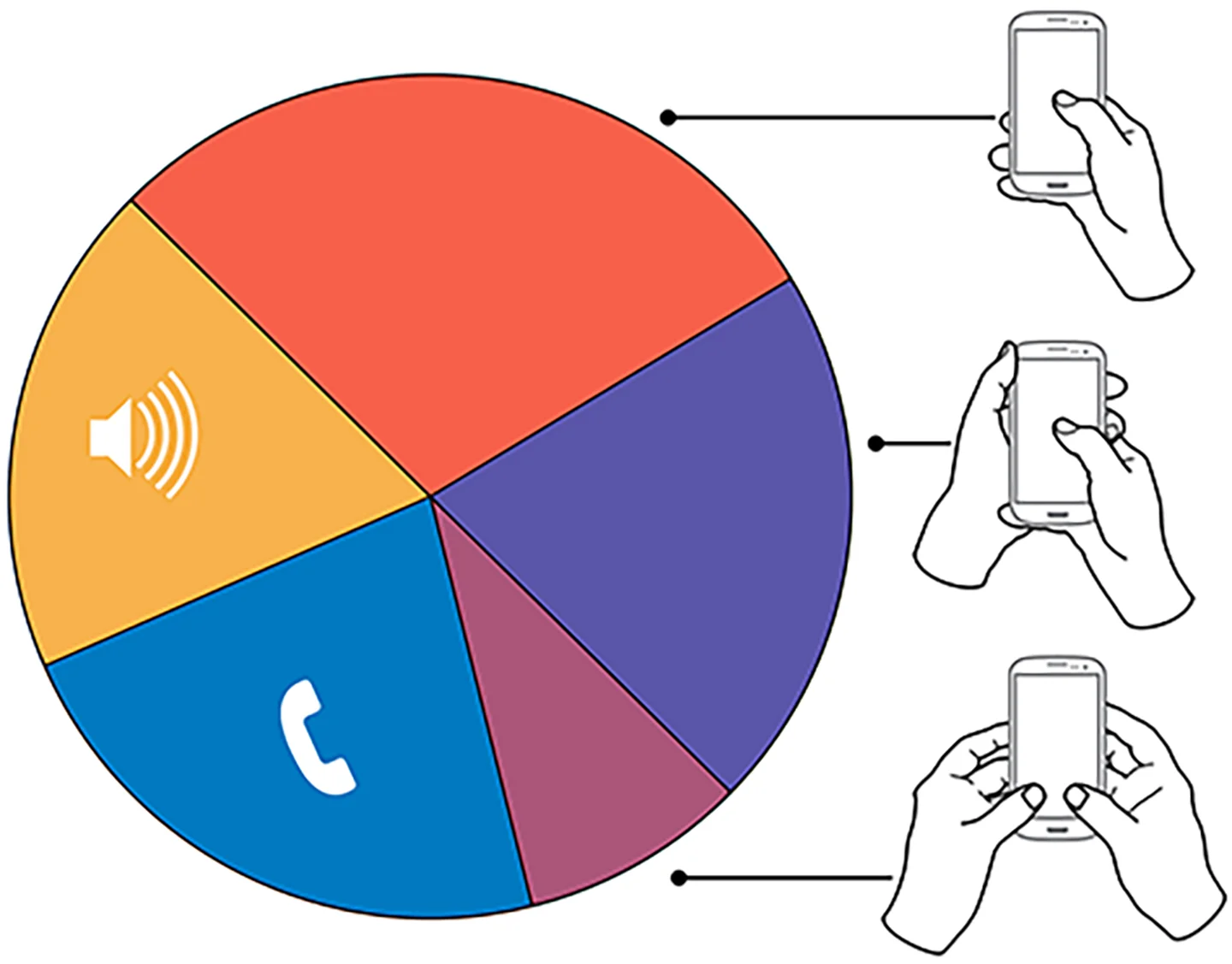
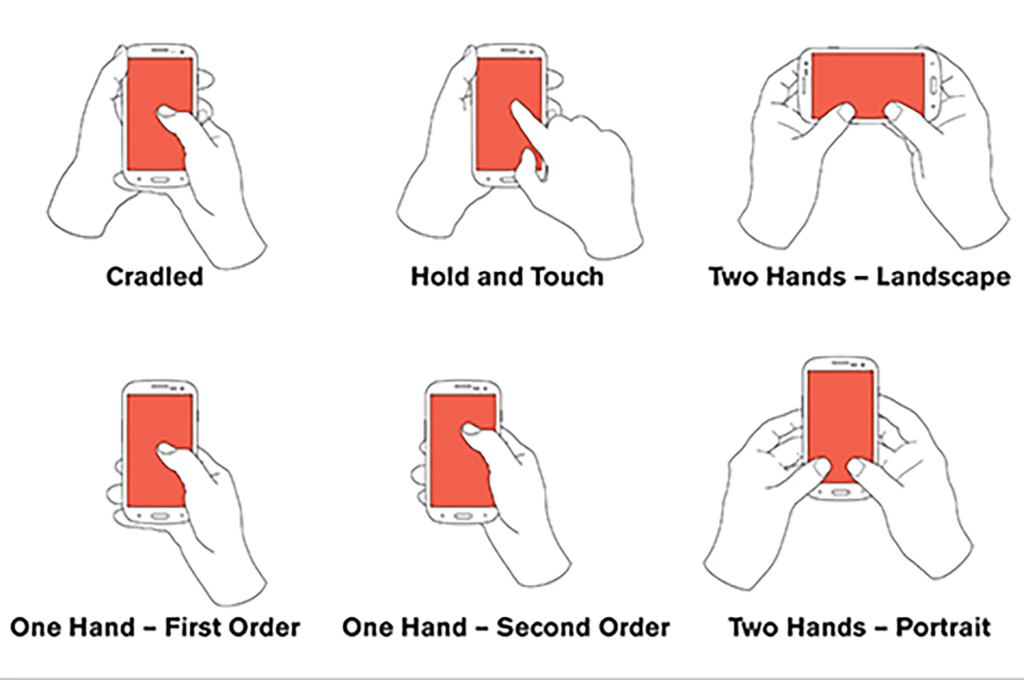
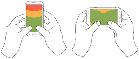
There have been countless studies on how people handle their phones, and the findings have been remarkably consistent for over a decade. The vast majority of users hold and operate their devices with one hand, using a single thumb to do almost everything. That was true in a decade ago and it's even more true now. The difference is that screens have gotten dramatically larger while thumbs have stayed exactly the same size.
This isn't a new observation.
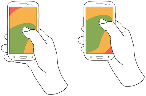
But what's changed is the scale of the problem. We've gone from 4.7 inch screens to 6.7 inches and beyond. Samsung's Galaxy Ultra lineup, Apple's Pro Max devices, and the growing wave of foldables like the Galaxy Z Fold and Pixel Fold have pushed usable screen real estate into territory that a single thumb simply cannot cover. The comfortable thumb zone, that arc of easy reach anchored at the bottom corner of the device, now covers less than half of the screen on most modern phones. Everything above the midpoint is a stretch. Everything in the far opposite corner is essentially unreachable without a second hand or an awkward grip shift.

Apple actually acknowledged this problem years ago with Reachability, the feature that slides the entire interface down when you swipe the bottom edge. It was a clever bandaid, but let's be honest: if your operating system needs a built in workaround so people can reach your UI, that's not a solution. That's an admission that the UI placement is wrong. Google has taken a more structural approach over time, gradually migrating key navigation and actions toward the bottom of the screen in Material Design 3. The bottom navigation bar, floating action buttons, and bottom sheets are all direct responses to the thumb reach problem. Apple's own apps have quietly followed suit, with Safari moving its address bar to the bottom in iOS 15 and many system interactions now anchored lower on the screen.
The native app world figured this out a while ago. Bottom tab bars have been standard in both iOS and Android development for years. SwiftUI's TabView and React Native's Bottom Tab Navigator exist specifically because designers and developers recognized that primary navigation belongs where thumbs can actually reach it. But on the mobile web, we've been slower to adapt. The hamburger menu in the top right corner became a near universal convention during the responsive design era, and a lot of teams still treat it as gospel. On a 6.7 inch screen, that top right hamburger might as well be on a different device. Users either ignore it, struggle to reach it, or shift their grip in a way that risks dropping their phone.
The solution isn't complicated, but it does require rethinking some deeply ingrained habits.
Navigation, primary actions, and frequently used controls need to live in the bottom half of the screen. Secondary actions, status information, and content that users consume but don't interact with frequently can occupy the upper regions. This is essentially inverting the traditional desktop mental model where the most important things sit at the top, and replacing it with a thumb first hierarchy where importance is measured by physical reachability.
For teams building with React Native or SwiftUI, this thinking should inform your component architecture from the start. Your navigation structure, your modal presentations, your form layouts, and your interactive controls should all be designed with the assumption that your user has one thumb and limited reach. Sheet style interactions that slide up from the bottom, floating action buttons in the lower right, and swipe gestures that work within the natural thumb arc are all patterns that respect how people actually hold their devices.
And this extends beyond phones. With foldables becoming more mainstream, you're now dealing with screens that can be 7.6 inches or larger in their unfolded state. The thumb zone doesn't just shrink on these devices, it becomes almost irrelevant on the far side of the display. Responsive layouts need to account for not just screen width but physical reachability, adapting interactive element placement based on whether the device is in a compact, medium, or expanded configuration.
The bottom line is simple. Your users are holding their phones with one hand and navigating with one thumb. They've always done this, but the gap between thumb reach and screen size has never been wider. If your most critical interactions require users to reach the top of a 6.7 inch screen, you're not designing for how people actually use their devices. You're designing for how you wish they did.
Ready to dive deeper?
- The Thumb Zone: Designing for Mobile Users (Smashing Magazine) - A thorough breakdown of thumb reach mapping and how it should influence your mobile layouts.
- Material Design 3: Navigation - Google's current guidance on bottom navigation and why it's the default pattern for mobile apps.
- Apple Human Interface Guidelines: Navigation - Apple's own guidelines for tab bars and bottom anchored navigation in iOS.
- Designing for Large Screen Devices (Android Developers) - Google's guidance on adaptive layouts for foldables, tablets, and large screen phones.
- How People Hold Their Phones (Steven Hoober) - Updated research from Steven Hoober on mobile grip patterns and how they should shape interface design.
Graphics taken from: uxmatters.com