Somewhere along the way, the web stopped being interesting. Conversion rate optimization became the only metric that mattered and every site started looking like the same A/B tested template. We're not saying data doesn't matter. We're saying it shouldn't be the only thing driving design.
The web doesn't have to look like this.
It just currently does because we let the dashboards make all the decisions. The teams that push back, the ones that insist on creative ambition within the constraints of good data, are the ones building the work that actually gets remembered.
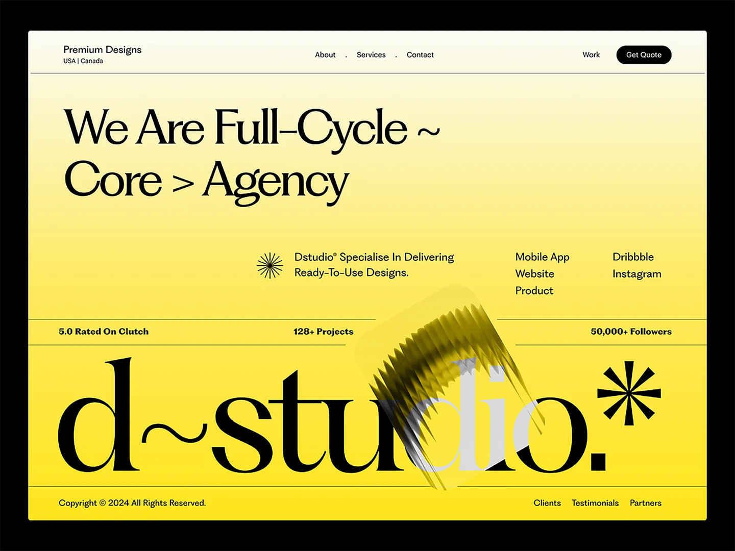
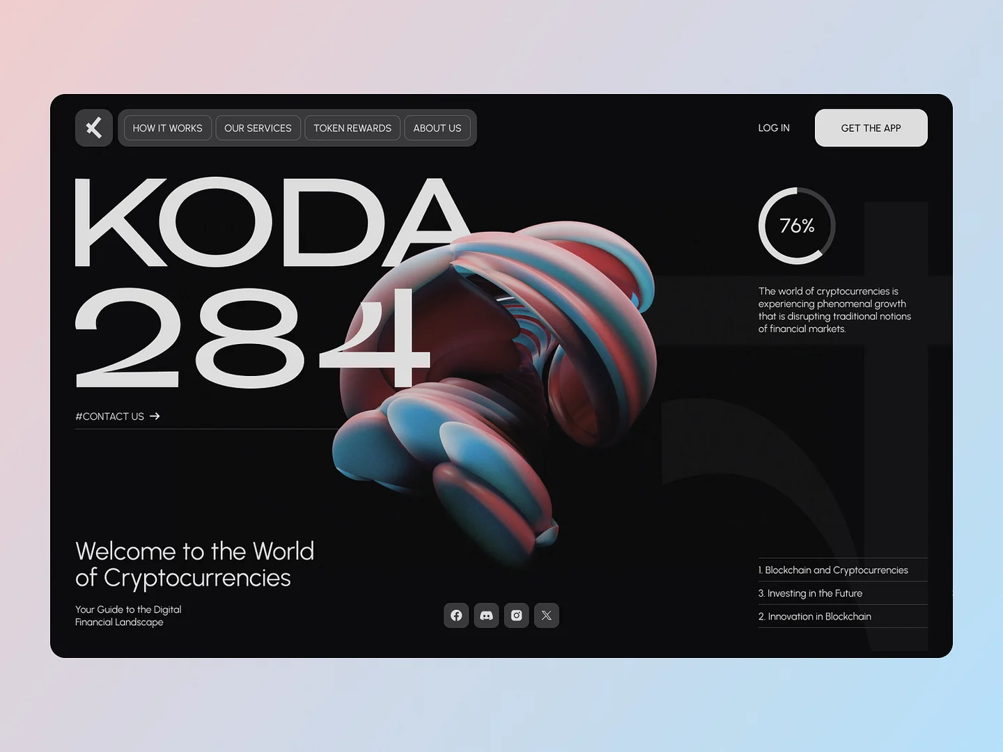
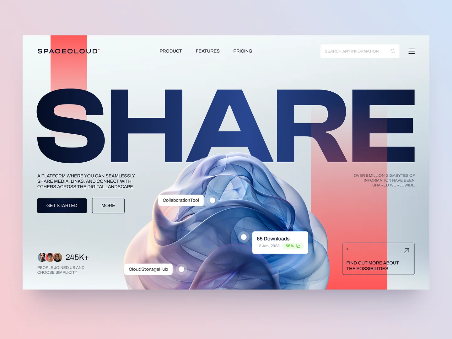
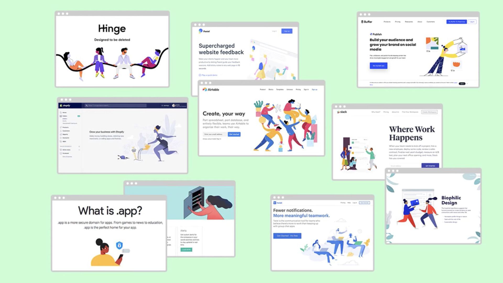
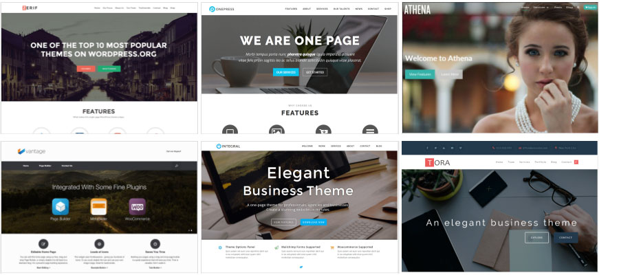
Open ten SaaS websites in a row. Go ahead, we'll wait. Hero section with a gradient background and a headline in a geometric sans serif. Three column feature grid with icons. Social proof bar with client logos. Testimonial carousel. Pricing table. Footer with four columns of links. You could swap the logos and copy between any of them and nobody would notice.
This is what happens when an entire industry optimizes for conversion at the expense of everything else.
Don't believe me? Check out this Fast Company Article from way back in 2020!
The rise of data driven design over the past decade has been, in many ways, a genuinely positive development. A/B testing gave teams the ability to make decisions based on evidence instead of gut instinct. Analytics platforms revealed how users actually behave instead of how designers assumed they would. Heatmaps showed where attention goes and where it doesn't. These tools brought accountability to a discipline that had historically operated on taste and intuition alone, and the products got measurably better as a result.
But somewhere along the way, the pendulum swung too far. Conversion rate optimization went from being a useful tool to being the only tool. Design decisions stopped being evaluated on whether they were good and started being evaluated exclusively on whether they converted. And because certain patterns consistently test well, teams across the industry converged on the same layouts, the same UI patterns, the same visual language, and the same safe, predictable, thoroughly optimized sameness.
The problem isn't that these patterns don't work. They do. A hero section with a clear value proposition and a prominent call to action will convert better than an experimental layout that confuses users. That's not in dispute. The problem is that when every competitor uses the same patterns, the optimization advantage disappears entirely. You're no longer outperforming the market with a data driven approach. You're matching it. And in a sea of identical experiences, the brand that stands out is the one users remember.
There's a cost to creative stagnation that doesn't show up in your analytics dashboard.
Brand recall. Emotional connection. The feeling a user gets when they encounter something genuinely surprising or delightful on the web. These are real factors that influence long term customer relationships, word of mouth, and brand loyalty, and they're nearly impossible to A/B test. You can't run a split test on whether your brand feels memorable because that effect compounds over months and years, not within a single session.
The web used to be weirder. More experimental. More willing to take risks.
In the early 2000s and into the 2010s, agencies and brands treated their websites as creative canvases. Some of those experiments were terrible. Many were inaccessible, slow, and confusing. But the best of them created experiences that people talked about, shared, and remembered. They pushed the boundaries of what was possible in a browser and they made the web a more interesting place. That energy has largely evaporated, replaced by a relentless focus on metrics that rewards conformity and punishes experimentation.
The irony is that the tools available to us today make creative execution easier than it has ever been. CSS has evolved enormously. Grid, custom properties, container queries, scroll driven animations, and view transitions give designers and developers expressive power that would have been unimaginable a decade ago. React's component model makes complex interactive experiences maintainable at scale. Libraries like Framer Motion and GSAP make sophisticated animation accessible to teams that don't have a dedicated motion designer. The technical barriers to creative web design have never been lower, and yet the output has never been more homogeneous.
We're not arguing that data doesn't matter.
It does. Conversion metrics, performance budgets, and usability standards should absolutely inform design decisions. But they should inform them, not dictate them. The most effective digital experiences we've built have been the ones where we used data to understand the problem and creativity to solve it, not the ones where we copied a template that some growth hacker on the internet said converts at 4.2%.
There's room for both. You can build a site that converts well and looks like nothing else on the web. You can optimize your checkout flow and still surprise users with unexpected moments of delight elsewhere in the experience. You can respect the data and still take creative risks. But it requires teams and clients who are willing to value craft alongside conversion, who understand that brand differentiation isn't just a marketing concept but a competitive advantage that manifests in every pixel of the product.
Ready to try something different?
- Awwwards - The best showcase of creative web design on the internet. A reminder that the web can still be weird, beautiful, and surprising.
- Codrops - Experimental UI concepts and tutorials that push the boundaries of what's possible in the browser. Consistently inspiring.
- Josh Comeau: CSS for JavaScript Developers - Josh's work demonstrates that deep CSS knowledge enables creative expression that most developers never explore.
- Framer Motion Documentation - The go to animation library for React. Makes sophisticated motion design accessible without sacrificing developer experience.
- The Web Is a Magazine (Frank Chimero) - Frank Chimero's writing on design, craft, and the web is some of the most thoughtful in the industry. Essential reading for anyone who cares about the state of digital design.