Global Energy System Map
An entirely new way to visualize and explore our complicated global energy systems.
the challenge
How do you explain the entirety of global energy systems, from production to consumption, across every energy source and use case. How do you do that in a way that students can actually understand and explore? Student Energy needed to visualize something that's inherently messy, interconnected, and impossibly complex. They wanted this visualization to become the centrepiece of their new website, and it needed to integrate cleanly with their Rails-based backend.
the approach
We quickly realized that showing everything would mean showing nothing useful. Our strategic focus became ruthless simplification—finding ways to visualize the energy system that revealed connections and relationships without overwhelming users with data. We worked closely with Student Energy's subject matter experts to identify the most important pathways and relationships, then designed an exploration experience that let students discover complexity at their own pace.
the solution
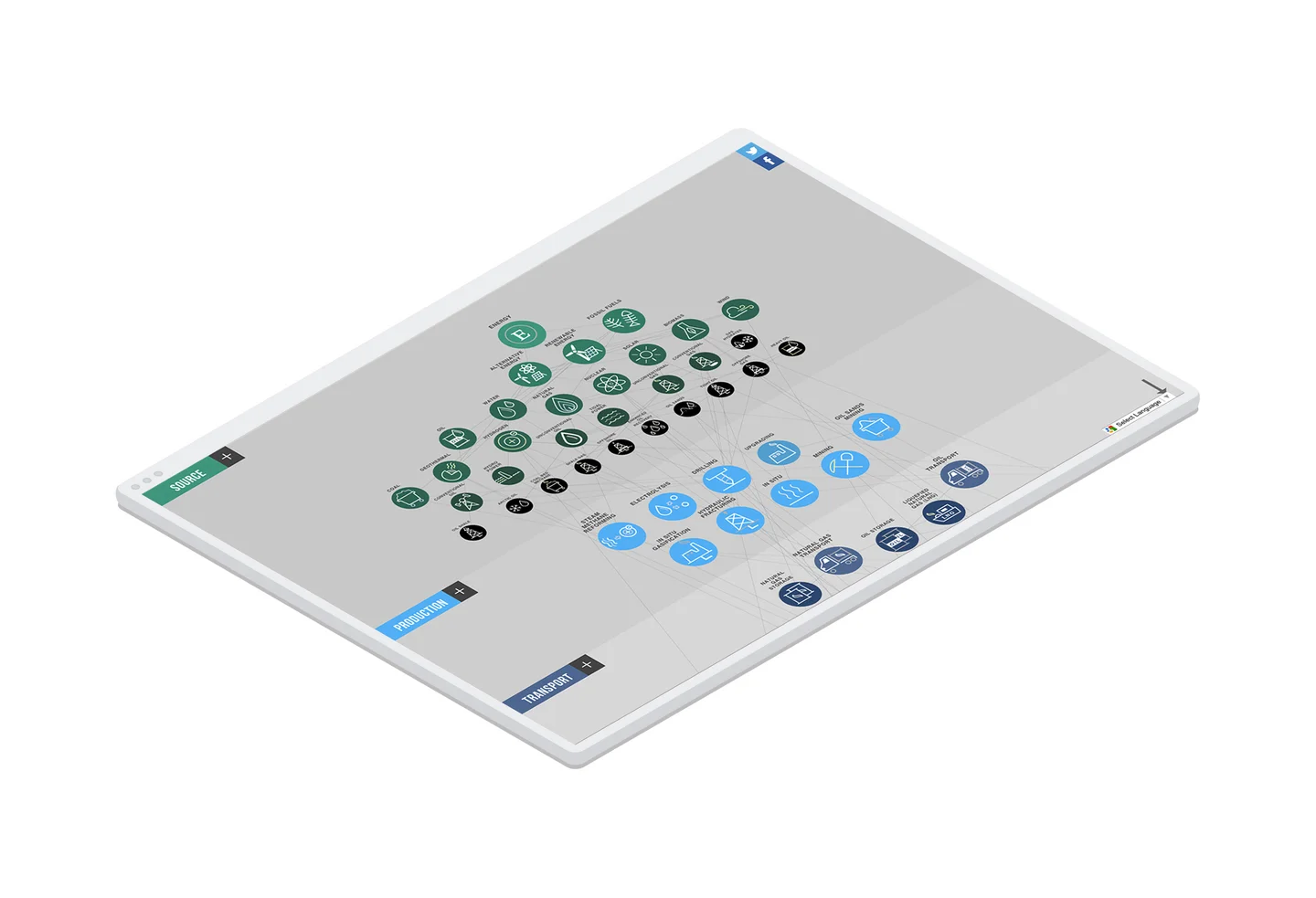
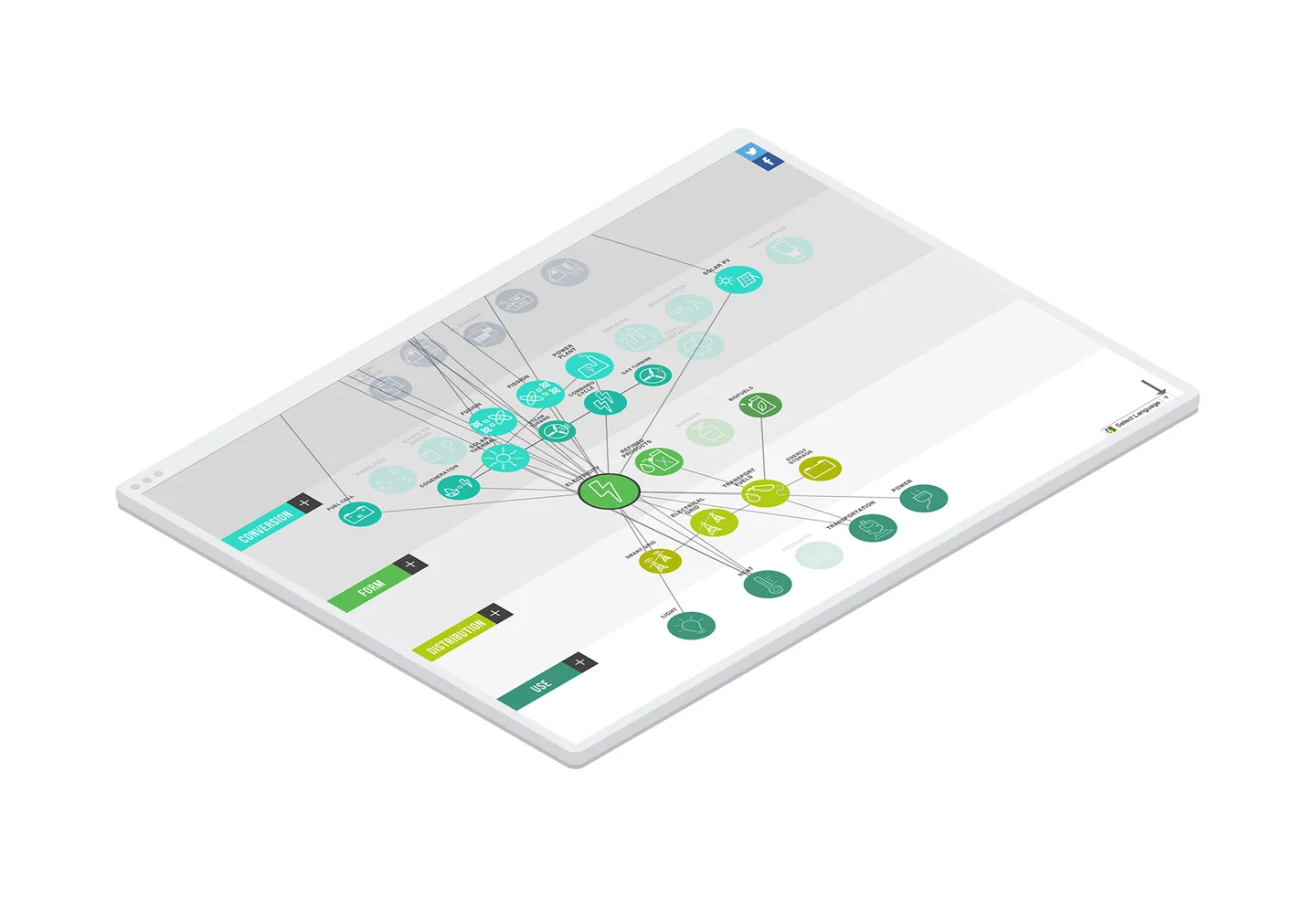
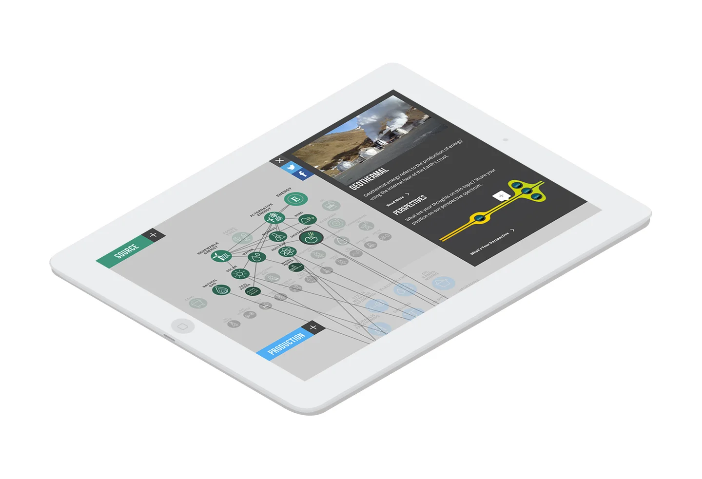
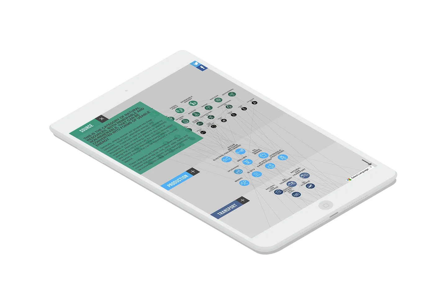
We built the Energy System Map using D3.js, creating a highly interactive visualization that students can explore intuitively. The system is fluid, flexible, and fully responsive—adapting gracefully from desktop exploration to mobile browsing. Users can trace energy from source to use, discovering how different parts of the system connect. It's educational without feeling like homework.
Simplicity was at the core of all our strategic and creative decisions. We realized that visualizing the entirety of the energy system was going to be a massive challenge—so we relied heavily on simplifying as much as possible to show clarity when exploring the entire map.
the results
The Energy System Map became exactly what Student Energy hoped for—a genuine centrepiece that drives engagement across their platform. Average time on the visualization exceeds 4 minutes, remarkable for educational content. The tool has been used by over 150,000 students globally and has been adopted as a teaching resource by universities and high schools across North America and Europe.
technologies
Live Project
View Live Site
D3.js Powers Deep Exploration
The Energy System Map needed to handle serious complexity while remaining genuinely enjoyable to explore. D3.js gave us the power to create fluid, responsive visualizations that make learning about energy systems feel like discovery rather than study.